Delpozo Resort 2017

I always look through Vogue.com's Latest Shows section to see what trends, colors and design elements are shining through. I love to see what things plant the seeds for a designer's creativity.  

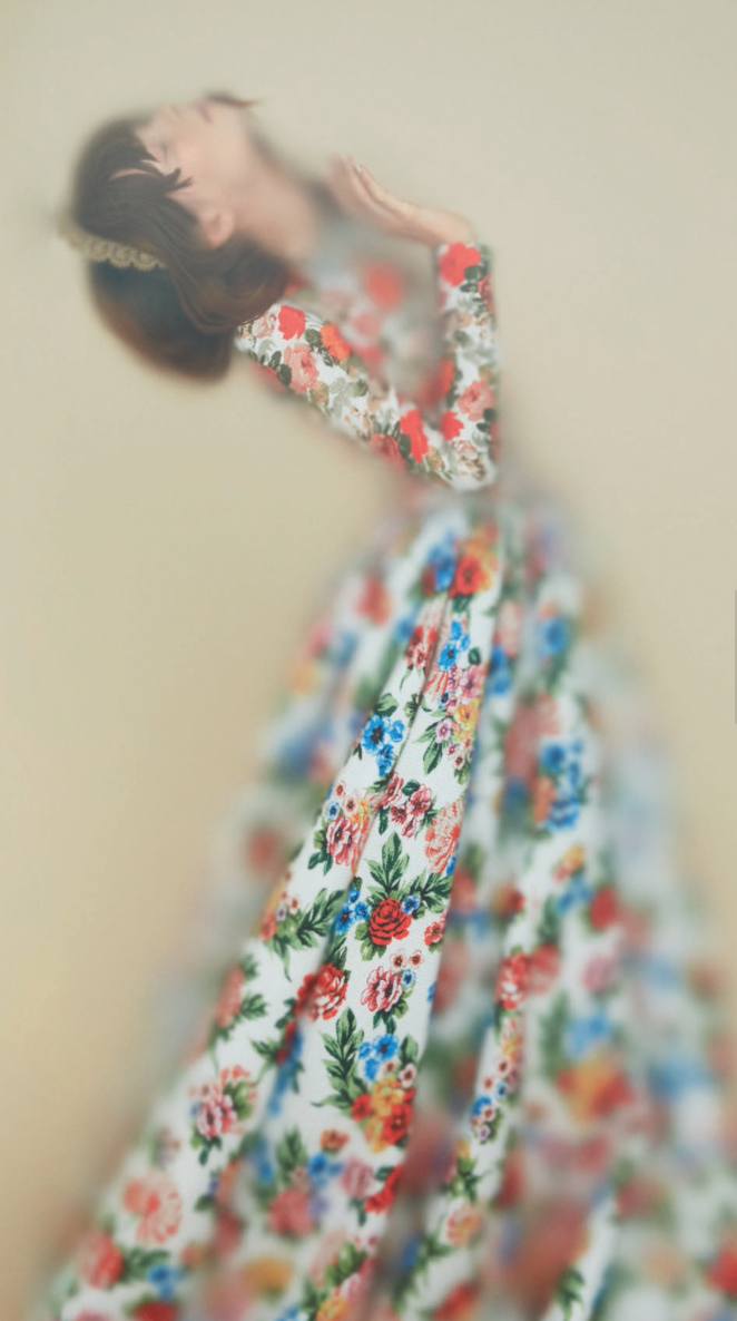
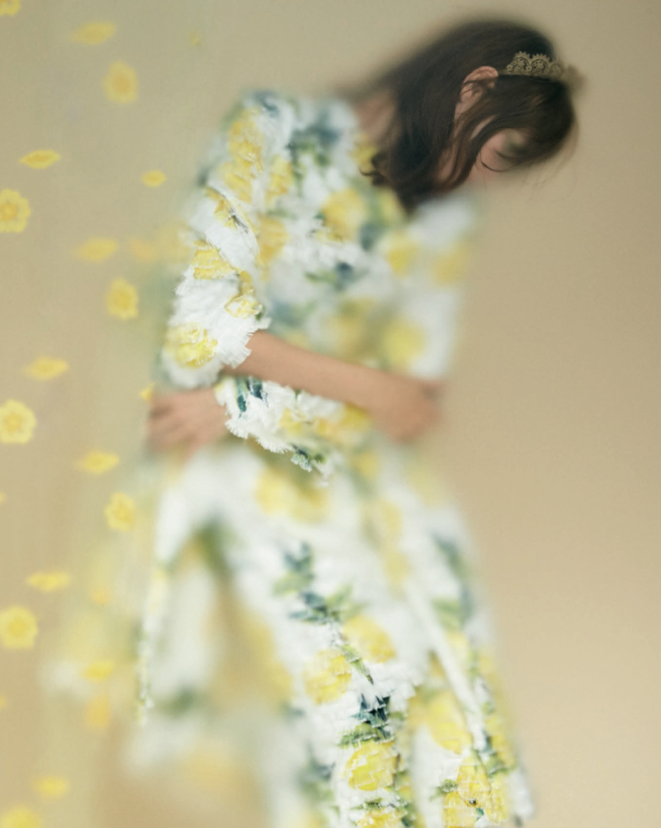
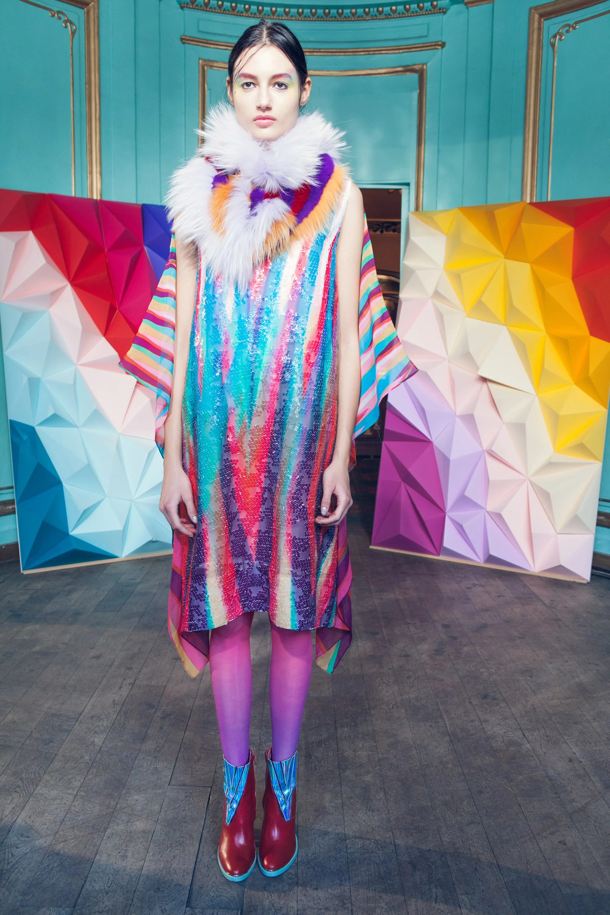
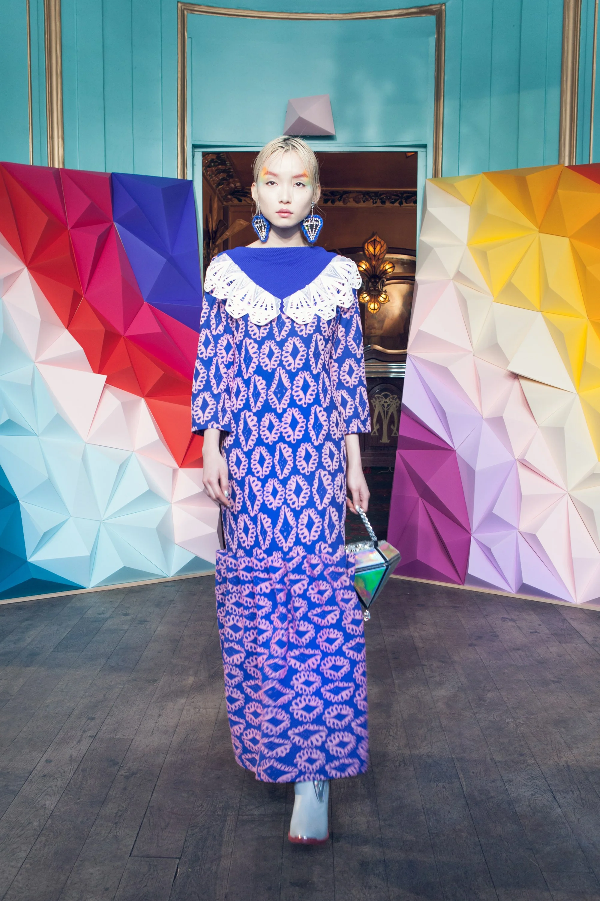
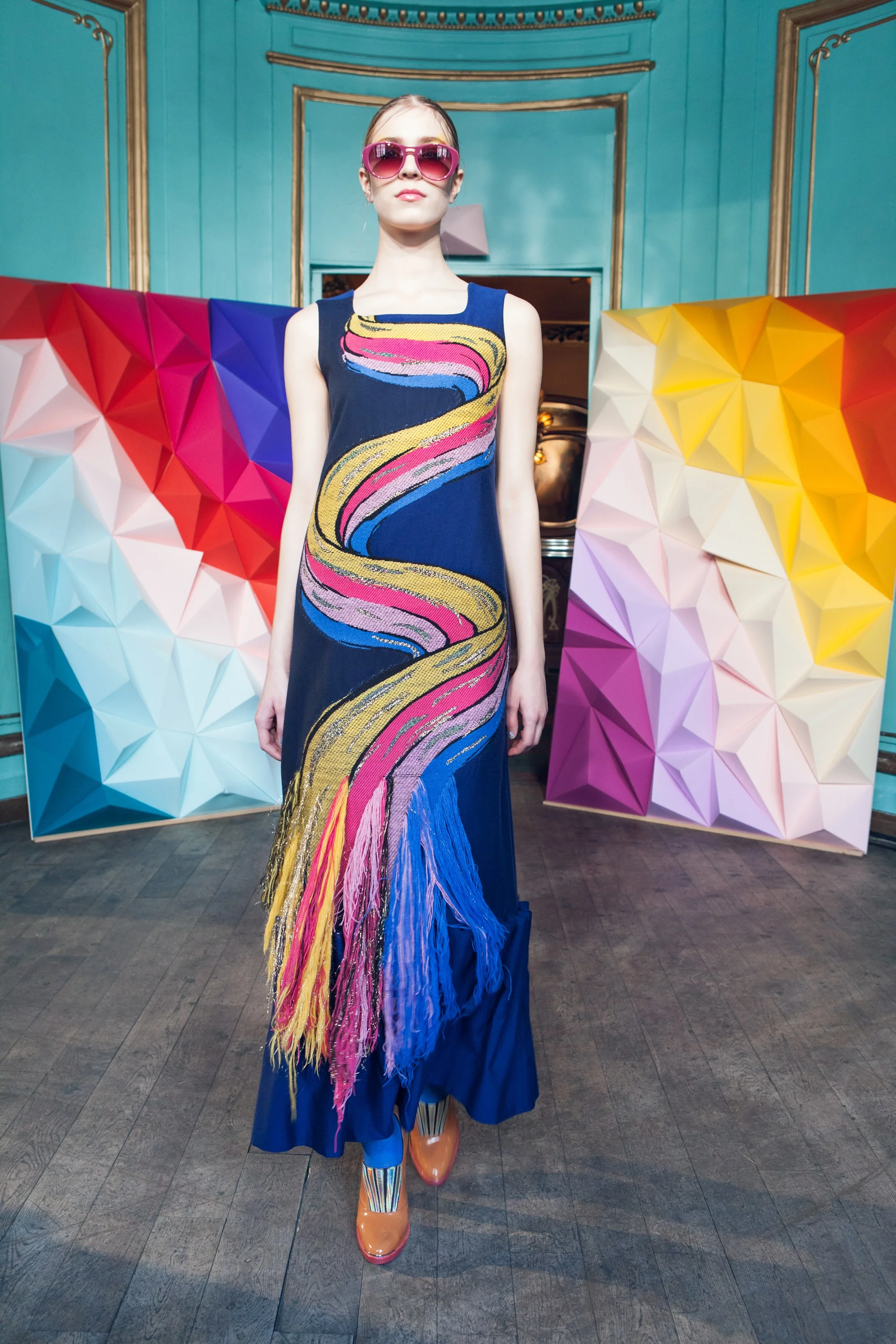
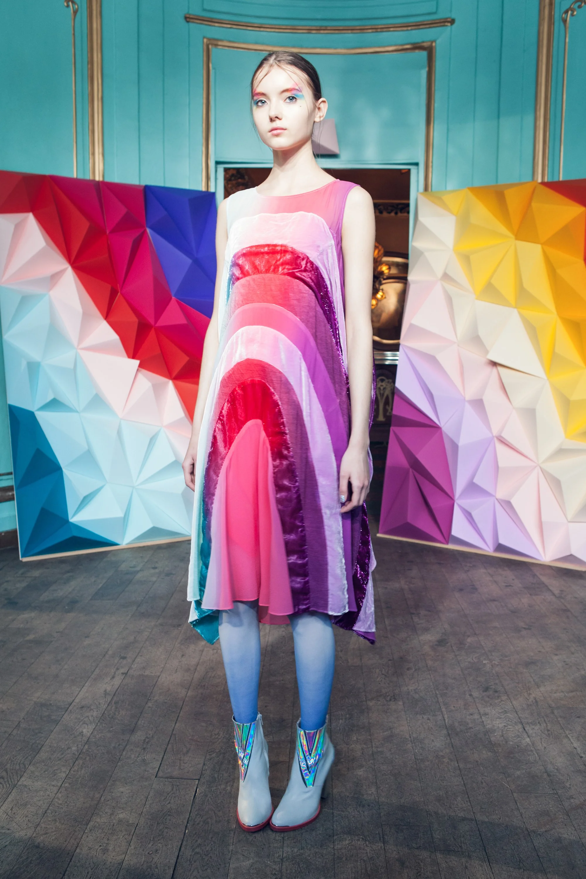
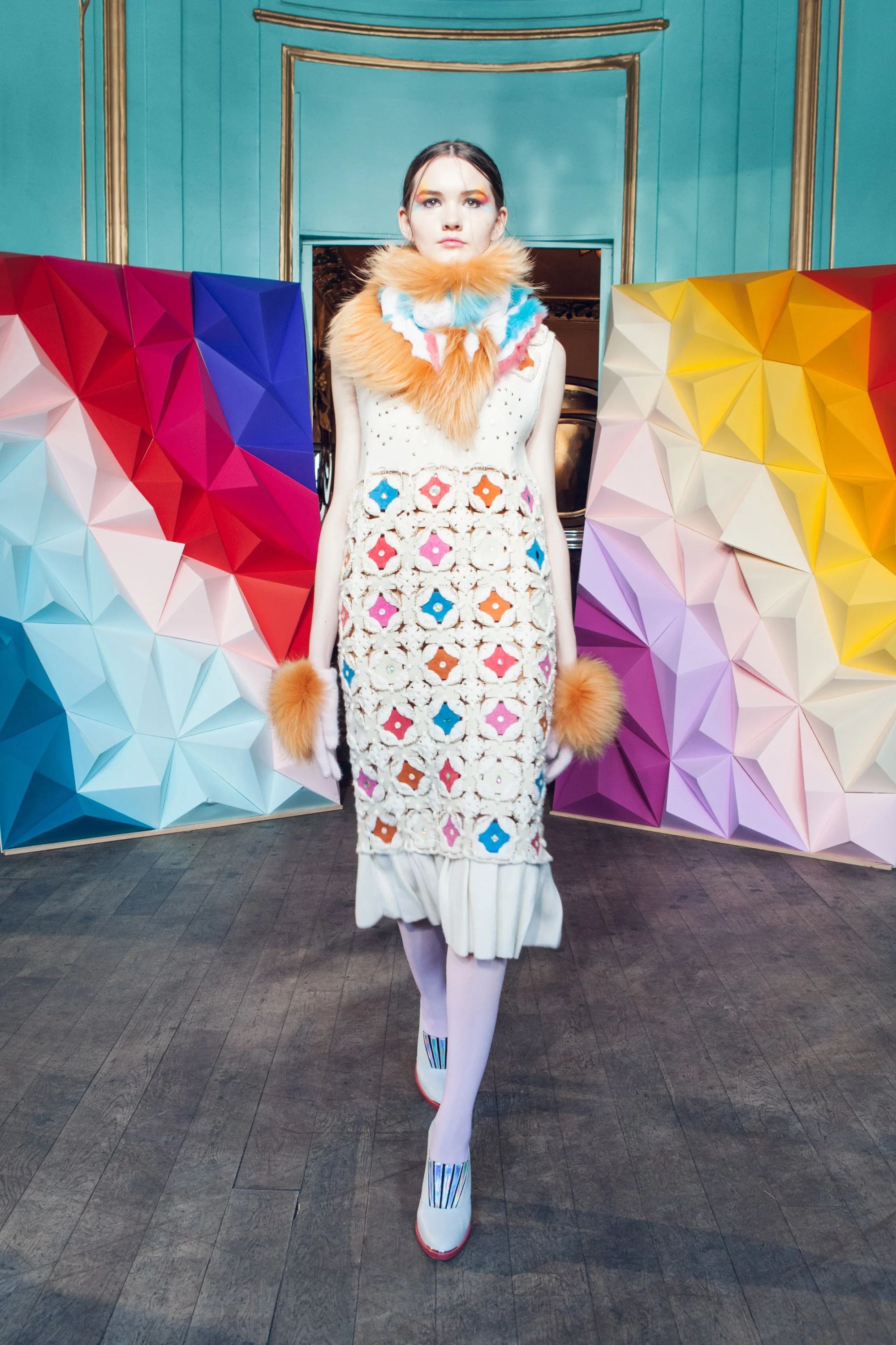
I stopped at Delpozo's 2017 Resort collection and the article read: "I touch with the eyes," as quoted in his collection notes and attributed to sculptor, Anthony Caro". Caro, as well as Georges Méliès (of 1902 silent film Trip to the Moon) were inspirations for this collection. I like that the inspiration isn't blatant, but that you can still feel both the sculptural and fanciful, spacey elements in his collection. 

For fun, click here to see the 14 min film Le Voyage dans la Lune. And see examples of Caro's sculpture here. Do you see the connections?

All images are from vogue.com, photos: Del Pozo

Artist Spotlight - Ugo Rondinone

I came across an image on Instagram of these colorful stacked rocks in the desert. Anything this bright is bound to catch my eye. After investigating a bit further, I found Swiss artist Ugo Rondinone's website and on it he says he has made his site-specific installation, Seven Magic Mountains, "a creative expression of human presence in the desert...that  punctuates the Mojave with a poetic burst of form and color."

And that it does. It's hard to grasp the true scale in the photos, but these colorful boulders stand 30 feet high, which means the bottom rock alone, is taller than a person. Cool! They are located about 10 miles south of Las Vegas and are up for another year or so. Road trip anyone?

Watch a really cool video on how this installation came to be over a 5-year period HERE>

All images are from Ugo Rondinone's website. Click through to see more.

All images are from Ugo Rondinone's website. Click through to see more.

June Instagram Fave - LIVINGPATTERN

Wow! I love to see how people are influenced by nature and this feed by Jenny Kiker is full of lush botanicals along with the sketches and paintings they inspire. She is a botanical artist who started Living Pattern "to connect herself and her audience to the still delicateness of nature and to themselves." I feel like I'm breathing fresher air just looking at these!

Reflective Patterns

© Katja Ollendorff

Some folks love either designing in repeat or putting designs into repeat, but I must admit it's not my favorite task. I'm much more of a free flow kind of person. But here is one easy way I can create a quick and interesting repeating pattern, that's different from the traditional square or half drop repeat. And if you are interested, you can watch a 15 minute video of me sketching what is to later become this beautiful decorative pattern.

WATCH HERE>

It's pretty amazing how simple it is and it's fun too!  It took me under an hour to create this pattern from start to finish. Of course I did a tiny bit of cleanup and if I were to do multiple colors, it would take longer, but after I did a live trace in Illustrator, I left the variations of gray because I liked the "antiqued" look that it created and that saved time.

Go to my Product Samples tab to see more reflective patterns that I have designed to be used as tablecloths.


Original scan

Original scan

Clean up any gaps

Clean up any gaps

So to start, fill a page in your sketchbook with a design—of anything! The key is to have shapes running off the edges and corners so that they will join when flipped horizontally and vertically. Keep this in mind as you are drawing and try to envision what will happen when they are reversed and joined. It makes for less clean up down the road.

Next bring your sketch into Photoshop and flip and copy the image both horizontally and vertically on the top, bottom and sides. You may need to fill in and do slight adjustments at this point if there are any gaps or strange seams (see image below left). 

That's it. You have yourself a cool reflective pattern that you can play with. Have fun! 

Flip horizontally and then vertically

Flip horizontally and then vertically


Sebastopol

As a single person who works from home, I find that I spend a lot of time alone. That means I have to work extra hard to get out, see people, make plans with friends, go on adventures and find inspiration. I took a staycation at a friend's house in Sonoma last week so it's been a while since my last post. I love exploring that area as there is endless inspiration. Just getting away from the city is enough for me to feel inspired! The smells, the light and peace and quiet are pretty much heaven to me. 

I took a day jaunt up to Sebastopol, a town I'd never visited before—I loved the small town feel and friendly people. I visited the Luther Burbank Experimental Farm and Arnold Drive (basically whatever Google told me I should do there), then I had a yummy lunch at the Gypsy Cafe on the main drag, stopped into a great gallery and chatted with some friendly locals along the way. 

I don't think my sense of adventure will ever leave me, because these kinds of days feed my soul more than anything else. Having new experiences, being brave, doing things alone, connecting with others outside my daily realm, seeing new things—I will always want more!  

When was the last time you took a day trip by yourself somewhere? Try it!  And see what treasures it brings you.

Junk art is by local artist Patrick Amiot. Every house on Arnold Drive has one of his works in the yard. Kitty Hawk Gallery on Main street is owned and run by artist Grace Levine. The works here are hers. Floral images were taken at the Luthur Burbank Experimental Garden.

May Instagram Fave - Lily & Hopie Stockman

Made my May Instagram pick just under the wire this month! I just love Block Shop scarves and one of the sisters behind the company is Lily Stockman. I thoroughly enjoy her images of her colorful studio, paintings, her dog, and her travels. Take a look at her site and feed and enjoy!

And if you want a double dose of awesome images, her sister Hopie's feed is equally wonderful. If you love textiles, color and travel both feeds are worth a follow.

All images are © Lily Stockman

Source: https://www.instagram.com/lilystockman/

Oh Vienna...

I so wish I was heading there now. My friend invited me to join her on a trip to Berlin, Vienna and Budapest (happening next week)—but unfortunately I had to bail. I had hip surgery recently and wouldn't be able to handle that flight, let alone be mobile enough for sightseeing! What a bummer. Boo hoo for me.

Anyway, since my grand hopes of viewing any Weiner Werkstätte (Vienna Workshop) art or textiles I could find there have now been dashed, I resorted to an internet search instead. There are many works of art from that company of artists, and the range and scope is incredible—from art, to postcards, to textile and furniture. My eyes are happy.

Vienna Workshop


Unusual Beauty

One of my favorite boards on my own Pinterest wall is called Unusual Beauty. This is a place where I save all my favorite images of things that don't seem to belong anywhere else. They are beautiful, strange, mesmerizing and really make me want to linger longer. Click through to see more!

Please note: None of these images are my own they are for personal inspiration purposes only - please click through for sources.

Peter Zimmerman Installation

I love these beautiful candy-colored floors of poured resin created by German artist Peter Zimmerman. The resin covers 1,400 square feet of floor at the Museum für Neue Kunst in Freiburg, Germany, where it complements his abstract art hanging on the walls above. Click here to read and see more on thisiscolossal.com

All images: © Bernhard Strauss

Weirdly Wonderful

This is just too cool not to share. Zeitguised, a design company based in Berlin, Germany offers so many captivating things that are different from anything I've ever seen. Check out their website here. It's worth a look around.

Some info on the video below as described on their website:

“Void Season” is a simulated fashion project.

Part dreamlike theatre, part lateral cargo cult hustle, a quick succession of bold garment designs acts as an ersatz runway show. In a minimal set of solid backdrops, radiant colors and oblique choreography second the exquisite design of costumes that have been entirely artificially generated.

A wealth of custom procedural surface detail emphasizes the uncanny rift between the realistic presence of the guises and the abstract vacancy of the digitized human movements.

I find these clips weirdly genius. 

Nature Inspired

Since I've been working from home this past year, I sometimes get a bit str crazy. For me, the best solution for this is to get out into nature and fresh air. I decided to take a drive up to Mount Tamalpais yesterday morning. It was so refreshing! It's only 40 min from the city after all and it's really paradise on a weekday morning. Very few people are up there and I kinda love to be there as the fog lifts and reveals the amazing green hills and views below. 

If you follow my two Instagram feeds (this one and this one) you might have seen a few pictures I posted. There were all sorts of sweet and colorful wildflowers all over the hills and they got me inspired to make this when I got home. 

All designs and images © Katja Ollendorff

All designs and images © Katja Ollendorff

April Instagram Fave: Ana Montiel

It's been a while since I shared a favorite Instagrammer. I just love Ana's colorful, abstract artwork and bold patterns. Her feed, that is filled with vibrant shapes and color as well as wonderful inspirational photography is a joy to peruse.

You can see more of her artwork on her website here. and her Instagram feed here

All images © Ana Montiel


Katja of Sweden

Katja of Sweden

I love that I am following in the steps of another Katja in textile design and I also love that her designs resonate so much with me—their bold patterns and bright colors really speak to my own design aesthetic.

Katja was born Karin Hallberg in Sweden, and later lived in NYC, where she went to Parsons School of Design. She created wonderful patterned fashions and later designed home textiles as well. 

I didn't realize the connection before, but I have a picture of myself standing in front of a Katja Bedding display in the window of NYC Macy's. The picture was taken in the early 80s and I'm pointing to the large sign of her (and my) name in the window display. It was the first time I'd come across my name anywhere in the United States. I was very excited about it and now I know whose designs they were advertising!  I later bought some of her towels and sheets for my dorm room in college. Funny to think of that now. I wish I could find that photo to share  with you. 

You can read some more about her here.

Katja of Sweden
Katja of Sweden
Katja of Sweden
Katja of Sweden
Katja of Sweden
Katja of Sweden
Katja of Sweden
Katja of Sweden

Color Changes Everything

Are you someone who...

  • Mixes paint and chooses a palette before beginning a design?
  • Uses reference material or an existing palette for inspiration?
  • Just wings it and let's the design speak first and the colors follow?

I think lean toward #3 with a little #2 thrown in. I've heard that many people begin painting with a specific color palette in mind and let the colors guide the design. I personally like to design in black and white first. I almost never have a palette in mind until the layout is finished. Once I have the full design in front of me, colors just start appearing in my mind based on the kind of design I have created. I open up my swatch panel and really just start plugging them in as I begin to visual the end result. I never worry about the initial palette because I know I can always change it.  Even if I paint something in color, I usually don't think too hard about the colors I put down.

Color can change the vibe of a design so much—I lean towards bold and bright colors, but that's just my personal aesthetic. If I have a client who is requesting a subtler color palette, I have to be able to change that design up to work for them too. 

Here are some examples of how different a design can look when the palette is switched up for different uses. Which would you apply for wallpaper?Stationery? A shower curtain? The possibilities and uses are endless! 


Make That Sketch Work

I'll often sit with my sketchbook and just doodle or draw single motifs. Other times I'll draw groupings of things like this mini jungle scene. I don't always have a plan for these sketches and sometimes they live forever in my sketchbook; but I found that with a little coaxing you can get big results.  

Here, I took a simple drawing and used it in two very different ways. The first idea was to use it as a framed art print for a kid's room. And the next was to try it as a lush jungle print. They are so different and I really love how they both turned out. 

My motto has always been to KEEP PLAYING. You never know the limit of a motif until you push it a little further. Have fun! 

� 2016 Katja Ollendorff
© 2016 Katja Ollendorff

© 2016 Katja Ollendorff

© 2016 Katja Ollendorff

© 2016 Katja Ollendorff